


Brand Guidelines
Typography
Contents
01
Intro
02
Primary Typeface
03
Secondary Typeface
04
Display & Heading Heirarchy
05
Usage Variations
06
Weights
01
Intro
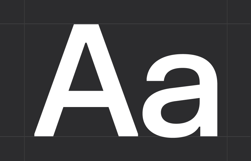
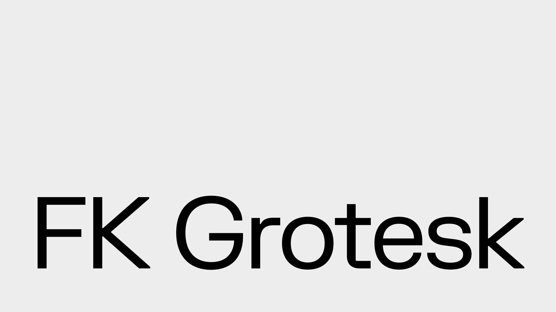
Our brand typeface is FK Grotesk we use it across all of our communications. It’s beautifully crafted characters give us a highly legible typeface that keeps the brands voice clear and simple.
Download Font
02
Primary Typeface
For headline messaging we use FK Grotesk with 100% leading, set to optical kerning and 0 tracking. For body copy we use FK Grotesk, but can bring variation to our messaging or highlight certain key words through the use of FK Grotesk Italic
03
Secondary Typeface
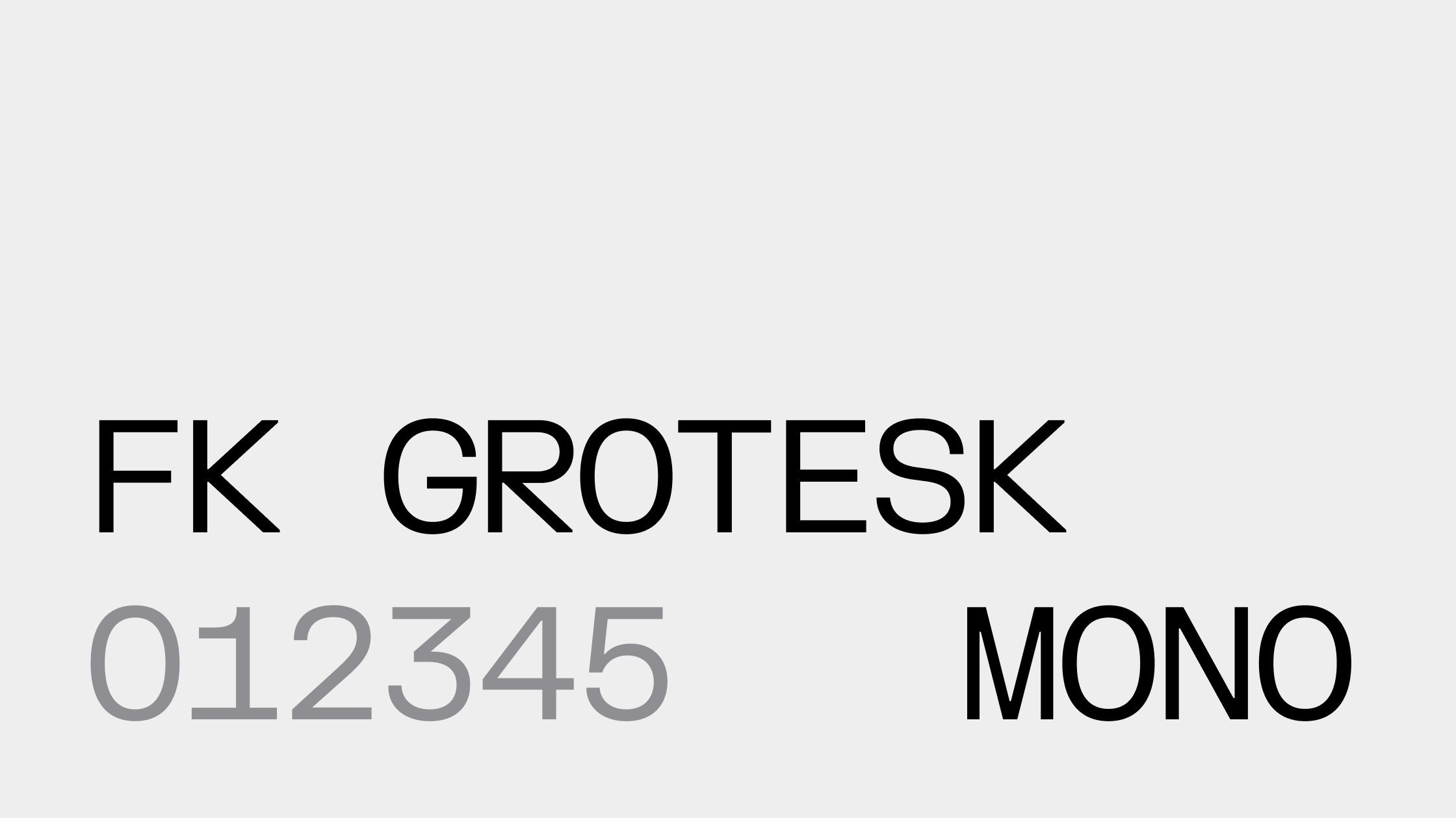
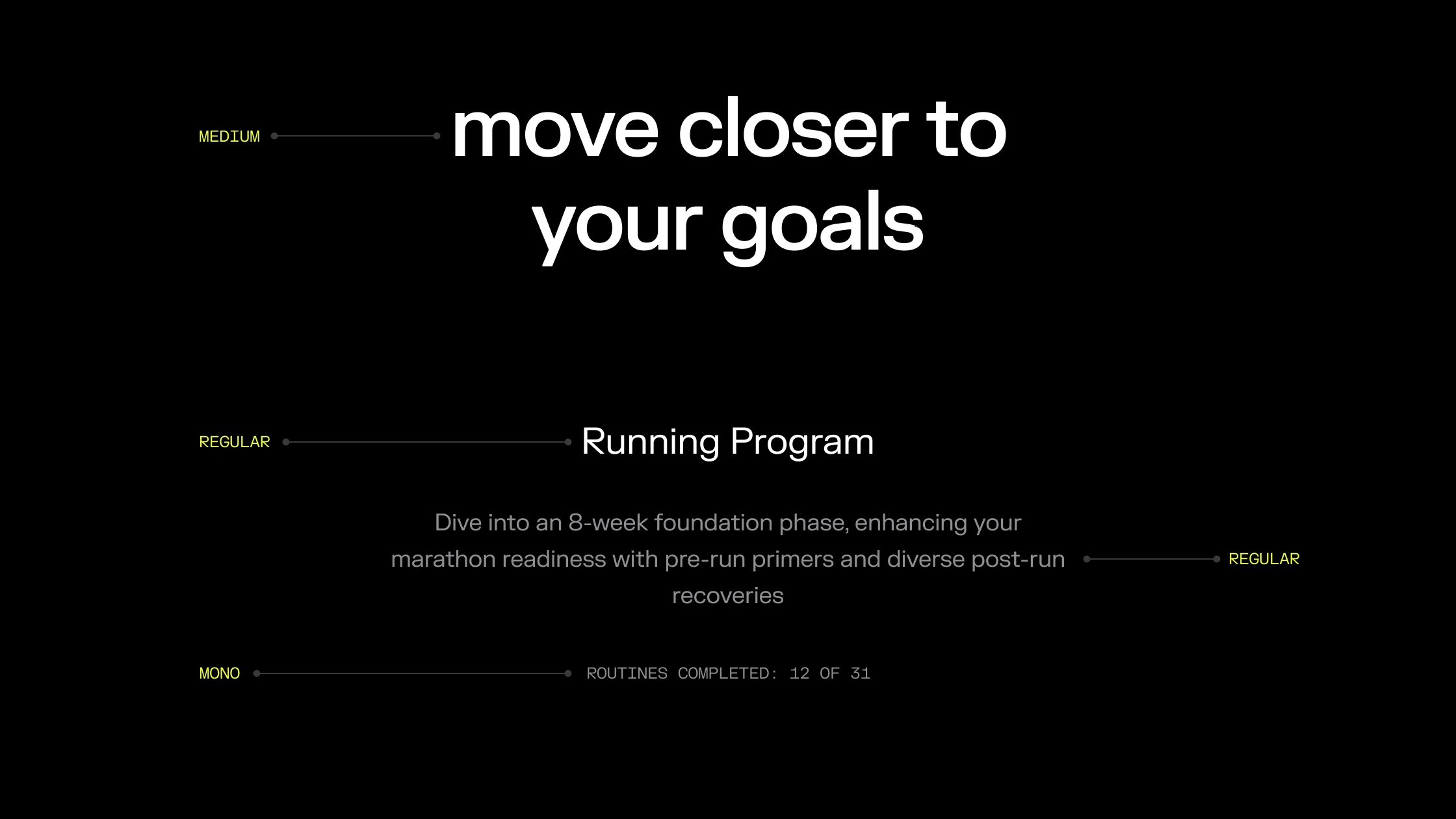
FK Grotesk Mono is our secondary typeface—built for clarity, trusted for precision. It supports our brand by delivering numerical and meta information with consistency and ease. Used sparingly and never to compete, this typeface plays a quiet but essential role—anchoring the edges of our storytelling with structure and utility. Think of it as the system behind the movement: always present, always aligned.
04
Display & Heading Heirarchy
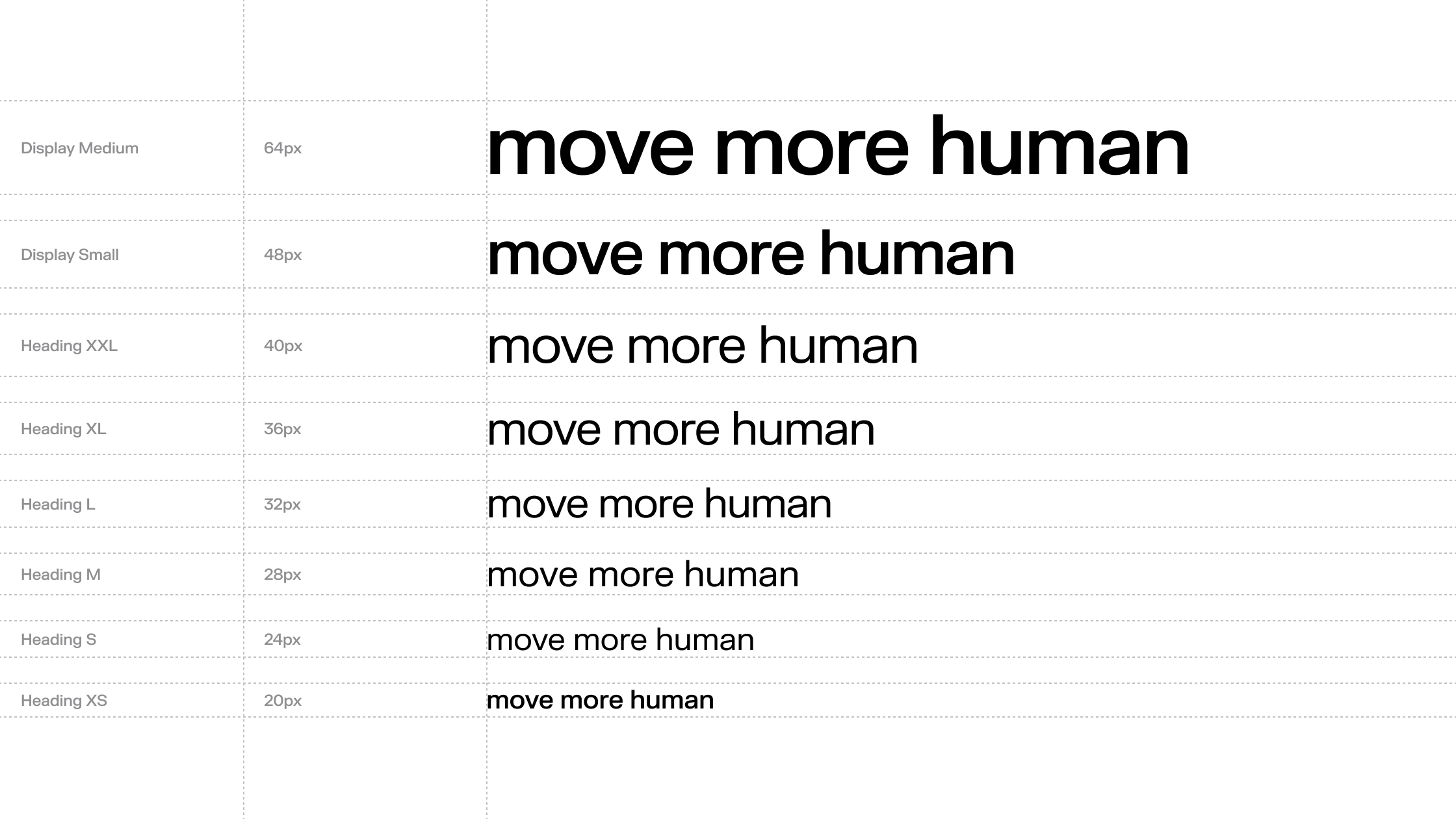
This is the core heading hierarchy used across the pliability mobile and web applications. It establishes a consistent typographic rhythm, balancing clarity with flexibility across viewports and breakpoints. Each style—from Display to Heading XS—is designed to scale responsively and maintain legibility across devices. Sizes are set in pixels for precision, and each level serves a clear role—whether it’s commanding attention in hero sections or providing structure within content modules.
05
Usage Variations
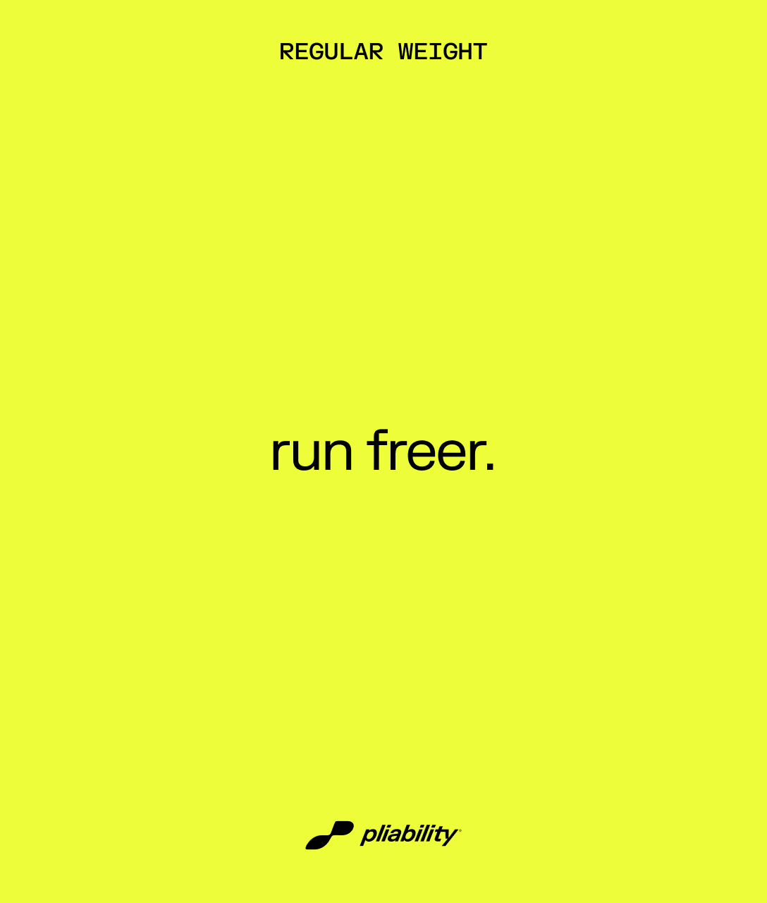
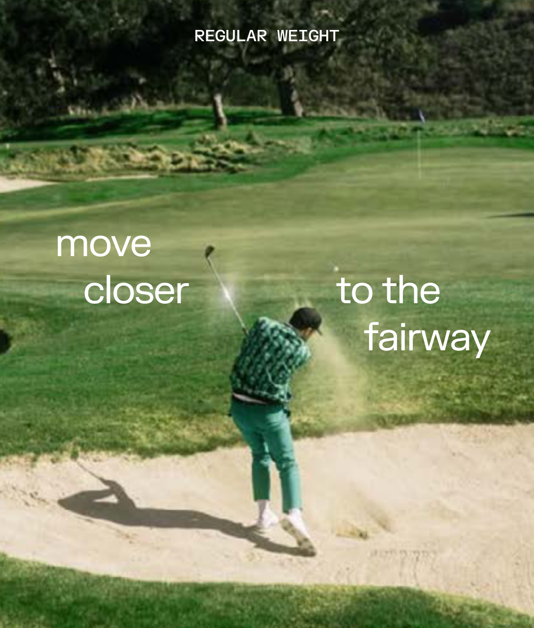
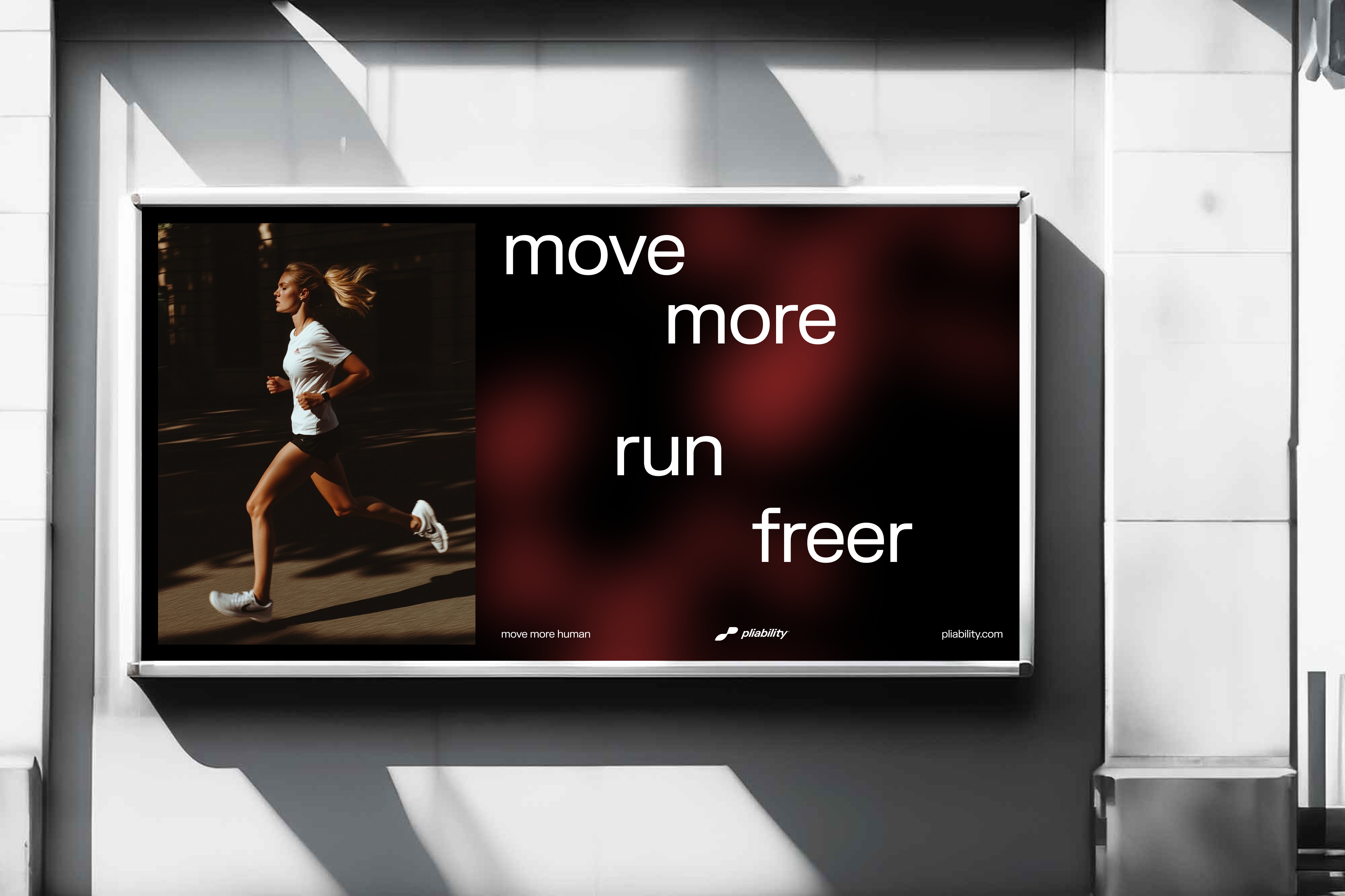
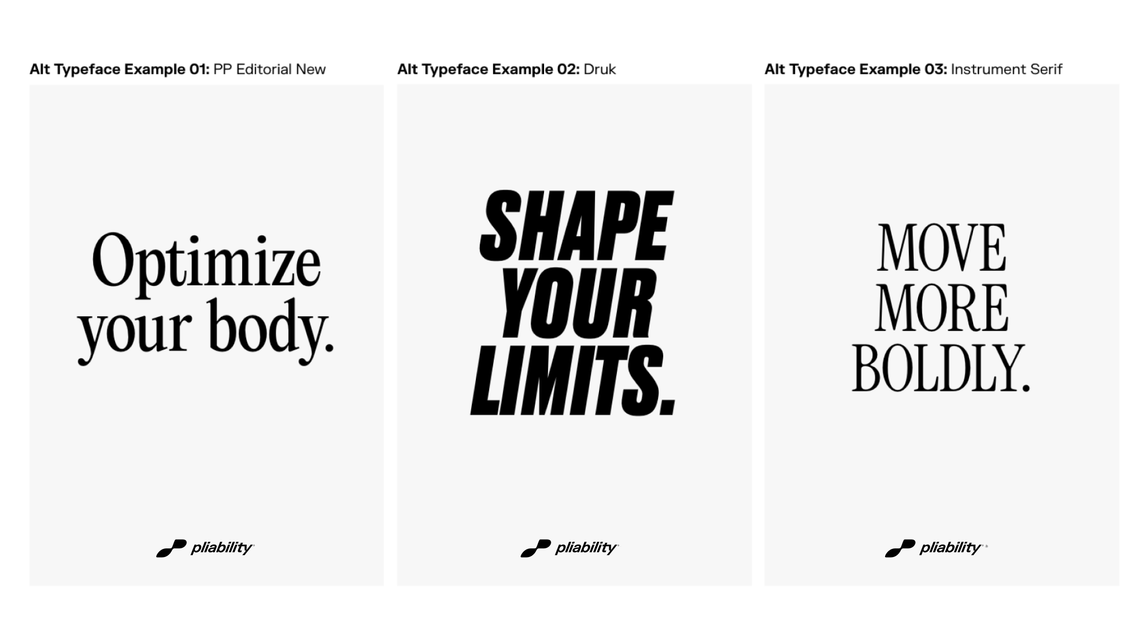
The simplicity of our typeface allows us to create a lot of variation within our messaging. To help bring movement and dynamism to our communications we can treat our typography in a variety of ways as shown here.
When using headlines which are 5 words or less we can set our messaging in lowercase. This brings a human element to our voice, tying back to our logo, and differentiates ourselves from competitors.
Supporting Text
Supporting Text
06
Weights
Each weight serves a specific purpose to aid in communicating the message.
07
Examples
pliability Brand Guidelines
Version 1.0
Questions? Please contact:


pliability, LLC © 2015-2026. All rights reserved.
Brand Guidelines
Typography
Contents
01
Intro
02
Primary Typeface
03
Secondary Typeface
04
Display & Heading Heirarchy
05
Usage Variations
06
Weights
01
Intro
Our brand typeface is FK Grotesk we use it across all of our communications. It’s beautifully crafted characters give us a highly legible typeface that keeps the brands voice clear and simple.
Download Font
02
Primary Typeface
For headline messaging we use FK Grotesk with 100% leading, set to optical kerning and 0 tracking. For body copy we use FK Grotesk, but can bring variation to our messaging or highlight certain key words through the use of FK Grotesk Italic
03
Secondary Typeface
FK Grotesk Mono is our secondary typeface—built for clarity, trusted for precision. It supports our brand by delivering numerical and meta information with consistency and ease. Used sparingly and never to compete, this typeface plays a quiet but essential role—anchoring the edges of our storytelling with structure and utility. Think of it as the system behind the movement: always present, always aligned.
04
Display & Heading Heirarchy
This is the core heading hierarchy used across the pliability mobile and web applications. It establishes a consistent typographic rhythm, balancing clarity with flexibility across viewports and breakpoints. Each style—from Display to Heading XS—is designed to scale responsively and maintain legibility across devices. Sizes are set in pixels for precision, and each level serves a clear role—whether it’s commanding attention in hero sections or providing structure within content modules.
05
Usage Variations
The simplicity of our typeface allows us to create a lot of variation within our messaging. To help bring movement and dynamism to our communications we can treat our typography in a variety of ways as shown here.
When using headlines which are 5 words or less we can set our messaging in lowercase. This brings a human element to our voice, tying back to our logo, and differentiates ourselves from competitors.
Supporting Text
Supporting Text
06
Weights
Each weight serves a specific purpose to aid in communicating the message.
07
Examples
Logo

Color System

pliability Brand Guidelines
Version 1.0
Questions? Please contact:


pliability, LLC © 2015-2026. All rights reserved.